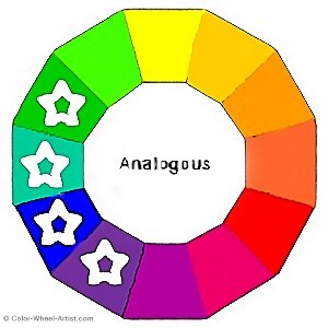
Analogous Colors are defined by selecting any three or more Hues on a Basic Color Wheel. By comparison to other color schemes, there are no spaces between Analogous Colors.
As a result of these Hues being so close together, it means they are generally in the same relative family of colors. Therefore, just like any close family, this fact can be both a blessing and a challenge.
More...
The blessing is this Color Scheme is automatically harmonious. In other words, it's nearly impossible for the colors to clash. But on the other hand, it can be a challenge to create enough variety. This means the results can be quite boring unless you make the most of your chosen color palette.
Read on, to discover how you can achieve both harmony and variety in your creative projects.
Mixing Analogous Paint Colors
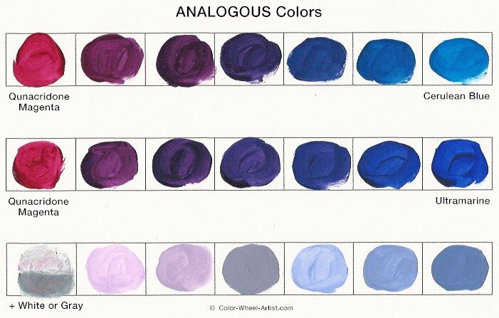
In our paint mixture example above, take a look at the top two rows. You'll notice how similar all the colors look. This can be a wonderful asset at times because, as you can see, nothing ever clashes. However, as mentioned before, the lack of variety can get a bit monotonous.
First of all, let me point out something important about my color choices for this particular swatch test.
You can see I've actually mixed only the three colors listed below. However, if I selected this Color Scheme for a project, it would appear like Purple is the fourth main colors.
Red/Purple: Quinacridone Magenta
Blue/Purple: Ultramarine
Blue: Cerulean Blue
In this case, notice the balanced Purples in the middle of the first and second rows. That's because a more harmonized Purple comes as a result of blending instead of using another pigment color. Therefore, keep in mind you don't always need to use every tube of paint color to create a wide range of Analogous Colors.
This is a perfect example of how pre-testing your pigments can save you time and effort while painting.
Creating Variety with Analogous Colors
Now that you've looked at how Analogous Colors automatically harmonize, let's look at how to keep them from being boring.
Begin by looking closely at the bottom row of paint mixtures above. These samples relate directly to the ones above in the second row.
In this case I've created several Tints and Tones by mixing in various amounts of White or Gray. You could also add more Black to any of the colors in the first two rows to create intense darks. Although there are only a few blends here, you could literally mix up an endless number of variations from super light to super dark.
As mentioned in another post, the easiest and most Neutral Gray is a mixture of White with Black in a range of values. Remember, Neutral Gray doesn't change the underlying Hue, it just reduces the intensity.
Alternatively, if you want to experiment, you can try other pre-mixed Gray pigments. However, some may alter your colors in unexpected ways. Therefore, if you want all the Tones within one artwork to be in harmony, use the same Gray throughout.
Another thing to notice about all three rows, especially the bottom row, is the color temperature. Compared to the warm colors on the left side, the cool colors on the right look quite refreshing. Make the most of these differences to add variety of temperature, intensity and values.
Painting Analogous Colors From a Photograph
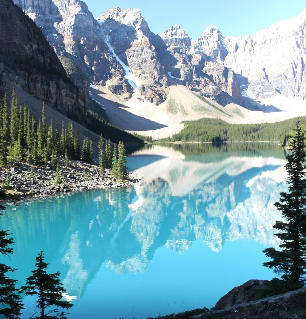
The photograph of the landscape above, is stunningly gorgeous. It just makes you stop in your tracks to look.
Of course one of the elements that make this stand out is composition. Composition is a huge topic which we can delve into at another time.
But there are a few other things that make this photograph particularly special.
First, there is a limited range of the Analogous Colors of Green, Blue/Green, Blue, and
Blue/ Purple. This is nearly the same Color Scheme as my mixture sample above. In this case though, there is no Red/Purple to warm things up. Therefore the colors stay cool and serene.
Second, as explained above, variety has been achieved by contrasting the light and dark values. Of course, this is a photo, but if you were to paint this scene, you'd adjust the values with White, Gray or a little Black mixed into the color.
Third, the colors have been given even more variety by making some intense and some subdued. This is where mixing colors and adding Gray Tones come into the picture. For example, the Blue at the lower center looks all the more beautiful next to the subdued Blue/Green in the lake shadows.
An Example of Analogous Colors in Fine Art
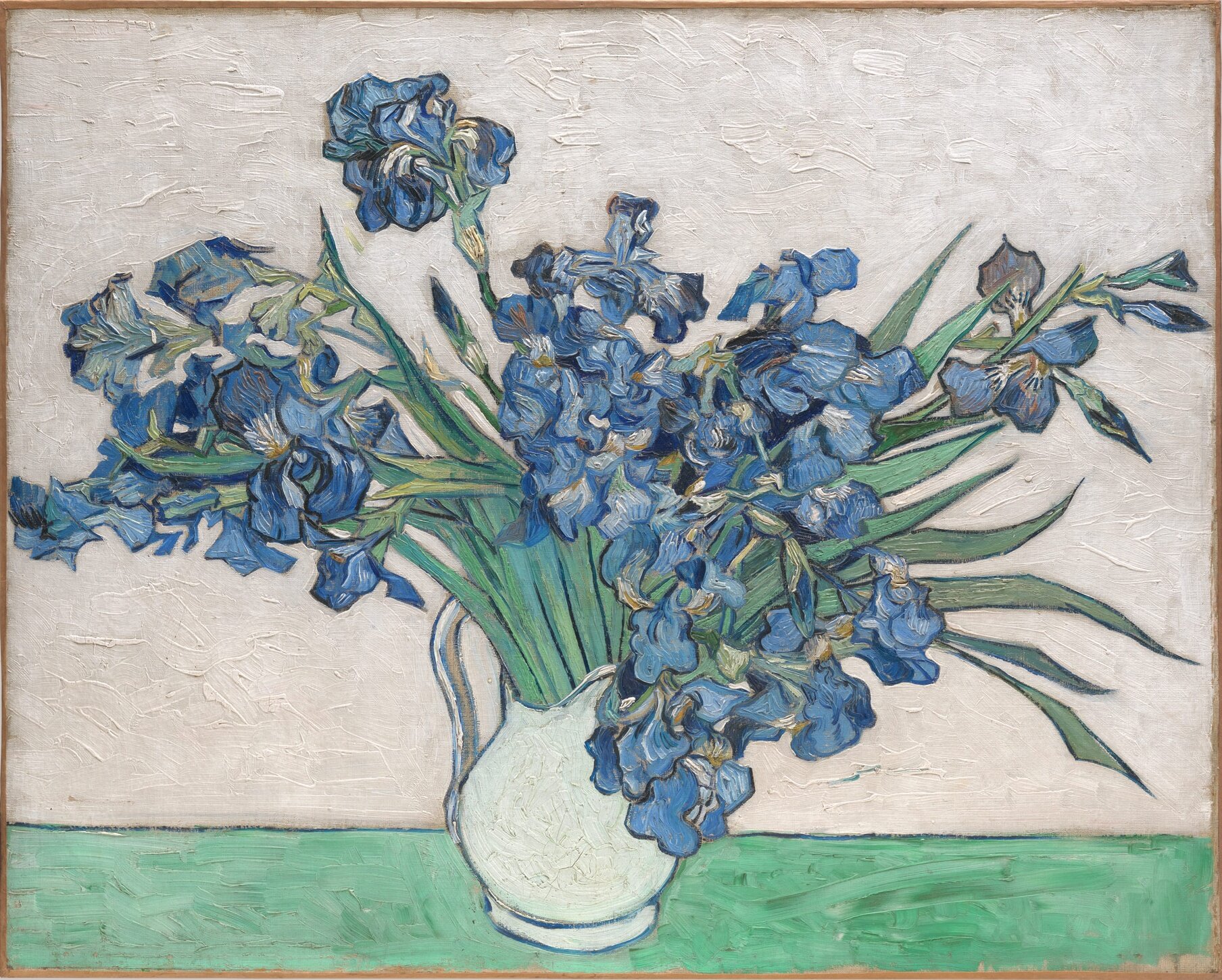
Above is a famous painting by Vincent Van Gogh of 'Irises in a Vase'.
He has used exactly the same Analogous Colors as as in the photograph above. Again these are Green, Blue/Green, Blue, and Blue/Purple. They make up the main colors within the painting.
However, being the genius colorist that he was, Van Gogh did something extra to make the colors pop. First of all, it appears he also used a tiny bit of Yellow/Green in certain areas of the leaves. This contrast against the Blue/Green within other parts of the leaves and the Blue/Purple of the Irises, gives everything sparkle.
Van Gogh also likely created the warm Neutral background by adding a touch of the Complementary Color Red/Purple to Yellow/Green with White. The warm Gray background is a wonderful contrast to the cool Tint of the vase, even though they are the same Value.
Painting Tips for Analogous Color Schemes
* Always start by selecting the range of Hues you want to work with from the Basic Color Wheel.
* Decide which Hue will be your Main Color, or in other words, the color you will be using in most of the painting.
* Take a few minutes before you begin to paint, to mix some color tests for reference, just like I did near the top of this page.
* Remove any pigment colors that can be easily created by mixing the other colors. This will have the benefit of creating more vibrant and clean colors.
* Remember to also use White, Gray and Black, or their equivalents to add variety to your painting. Contrast the color value (light to dark), temperature (warm to cool) and intensity vivid to subdued).
Let's Review What You Learned
- Analogous Color Schemes work with three or more Hues on a Basic Color Wheel along with all their mixed variations.
- Because the colors are so similar, it's best to eliminate any pigments that can be mixed. Take a look again at my samples for reference.
- Always accentuate one of the Hues as your main color .
- If you create your Tints, Tones and Shades with any pigments other than White and Black, test first and then use the same neutralizing pigments throughout.
