

Complementary Colors
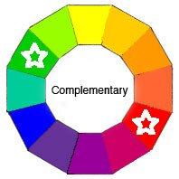
Complementary Colors are any two Hues positioned exactly opposite each other on the Basic Color Wheel.
Here, as an example I’ve chosen Red and its opposite Green.We tend to think of this pairing as typically intense Christmas colors. But there’s an unlimited variety of color mixtures, tints, shades and tones that can be achieved using only these two colors plus white and black.
Is it Complimentary or Complementary ?
Many people get confused between Complementary with an ‘E’and Complimentary with an ‘I’. The word complimentary simply means flattering of course. However a complement with an ‘E’ is a bit more complex.
These pairs on the Basic Color Wheel have a special relationship. When they are placed next to each other, they make the other appear more intense and brighter. This is a phenomenon in Color Theory called Simultaneous Contrast.
That’s because, being opposite, one color is always cool and the other always warm with the greatest contrast. Plus, taken together, the 2 colors are always a combination of all threePrimary Colors meaning one completes or ‘complements’ the other.
The fact that the two opposites ‘complete’ each other means that they will also neutralizeeach other when mixed together.
Mixing Complementary Colors
When you mix two opposites together anywhere on the Color Wheel, the result becomes increasingly neutral.
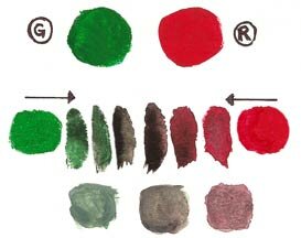
In my Complementary paint swatch sample, I’ve shown Red and Green. See how quickly the brightness of each gets dulled down. On the bottom row, I’ve added a little white to demonstrate how you can easily achieve a lovely range of neutrals without using black.
YELLOW + VIOLET / PURPLE = WARM GRAY
BLUE + ORANGE = COOL BROWN
RED + GREEN = WARM BROWN
Knowing this little trick with complementary colors is really valuable when you have paint colors that are a touch too bright but you don’t want to change them too much. Adding gray (black + white) as we have with other Color Schemes can flatten your color. Instead, by simply adding a tiny dropof the Complement, you can get a more neutral version of the original.
Hot Tips ! How to easily mix paint colors
- To dull down a color without adding black or grey, add a tiny drop of its complement.
- To make a color stand out, place a tiny accent of its complement next to it.
- Opposing colors work best when they are of similar intensity.
- Make one of your Complementary Colors the dominant one in your palette.
- Use various intensities of that dominant color, by adding different proportions of its complement. Then vary the values by adding white to lighten, black to darken or gray to soften.
- For contrasting accents choose the non-dominant color. Make sure it has a little of the dominant hue mixed in to tone it down a touch. Otherwise these accents will jump out to the eye a bit too much.
Check out these Color Schemes
Split Complementary
Triad
Complementary Triad
Modified Triad
Rectangular Tetrad
Square Tetrad
Adjacent Tetrad
Analogous
Analogous Complementary
Multi-Color