

Monochromatic Color Schemes
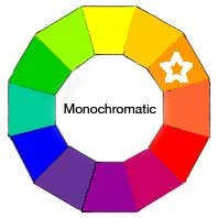
A Monochromatic Color Scheme is created by taking any oneof the twelve Hues from the Basic Color Wheel and repeating it in various Tints, Shades and Tones.
On the Color Wheel at right, you see Orange has been selected. You might think Orange is too bright to use as the basis for any color project. Or you may think that using only one color will get really boring.
You would be surprised how many variations, both obvious and subtle, can be achieved from just one color. This monochromatic color scheme approach is actually considered verysophisticated and usually creates a calming effect.
Take a look at how many possibilities that one color can begin to give us.
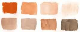
In my studio, I simply took a pure Orange paint and mixed a little of the following pigments to quickly create these eight colors.
- some white to get lightest Tints
- tiny drop of black to get darkest Shades
- a little gray to Tone things down
- more Orange to increase color
There are only 8 swatches shown here, but variations can be virtually endless. As you can see, the effect can be quite interesting.
Notice how a monochromatic color scheme can have a variety of beautiful paint colors in rich deep browns, pale corals, warm taupes, and exciting jewel tones. All from one color – ORANGE
Remember, you can do the same thing with any of the Hues on the Basic Color Wheel.
Try This !!
1. Take out several sheet of plain white, or watercolor paper and brushes.
2. Get your paints out. Keep it simple like watercolor, poster paints or acrylic.
3. Test out each of the twelve colors one at a time.
4. Take your time and see how many variations of each hue you can create.
5. Mix tiny increments of black, white and gray to each color.
6. Be sure to keep them for reference. Yes, even the ones you think are mistakes.
There are no mistakes – only experience !!
Check out these Color Schemes
Complementary Color Scheme
Near Complementary
Split Complementary
Triad
Complementary Triad
Modified Triad
Rectangular Tetrad
Square Tetrad
Adjacent Tetrad
Analogous
Analogous Complementary
Multi-Color